Overview
eCheck empowers Specialty Pharmacy patients to pay for prescriptions online quickly and securely using their checking account. Design helped reduce overhead cost of payment processing by 25%.
Team
We worked as a fully remote team spread across the US. Partners included:
- Product Manager
- Accessibility Designer
- Engineers
- Content Designer
My Role
I served as the sole UI/UX designer for this initiative, taking ownership of the design process from journey mapping to high-fidelity prototyping and developer handoff. These are my contributions to this initiative:
Research
Researched online precedents for paying by electronic check to understand existing visuals and patterns. I applied the learnings from this research to improving the eCheck experience design.
User Experience Design
Researched online precedents for paying by electronic check to understand existing visuals and patterns. Then I applied the learnings from this research to improving the eCheck experience design.
User Interface Design
Designed a modern, clean User Interface that aligns with the user experience design. Implemented responsive design to ensure the desktop experience is equivalent to the mobile design.
Online Payment Transactions: An Overlooked Touchpoint
Payment is a critical yet overlooked part of user experience. Enterprise Payment Platform exists to ensure that payment, a frequently underestimated touchpoint in the user experience, does not prevent users from accessing our services.
Empowering Specialty Pharmacy Patients To Pay Online By Checking Account
Prior to this initiative, CVS Health's digital experiences only accepted credit or debit cards. Our Specialty Pharmacy patients needed a secure way to pay with their checking accounts. The solution was to design an electronic check (ACH) or “eCheck” payment experience and integrate this into our payment platform.
eCheck Advantages
Providing the ability to pay by electronic check offered meaningful advantages:
- Real-time authorization of funds
- Lower risk of fraud and returned payments
- Faster payment processing
eCheck Scenarios
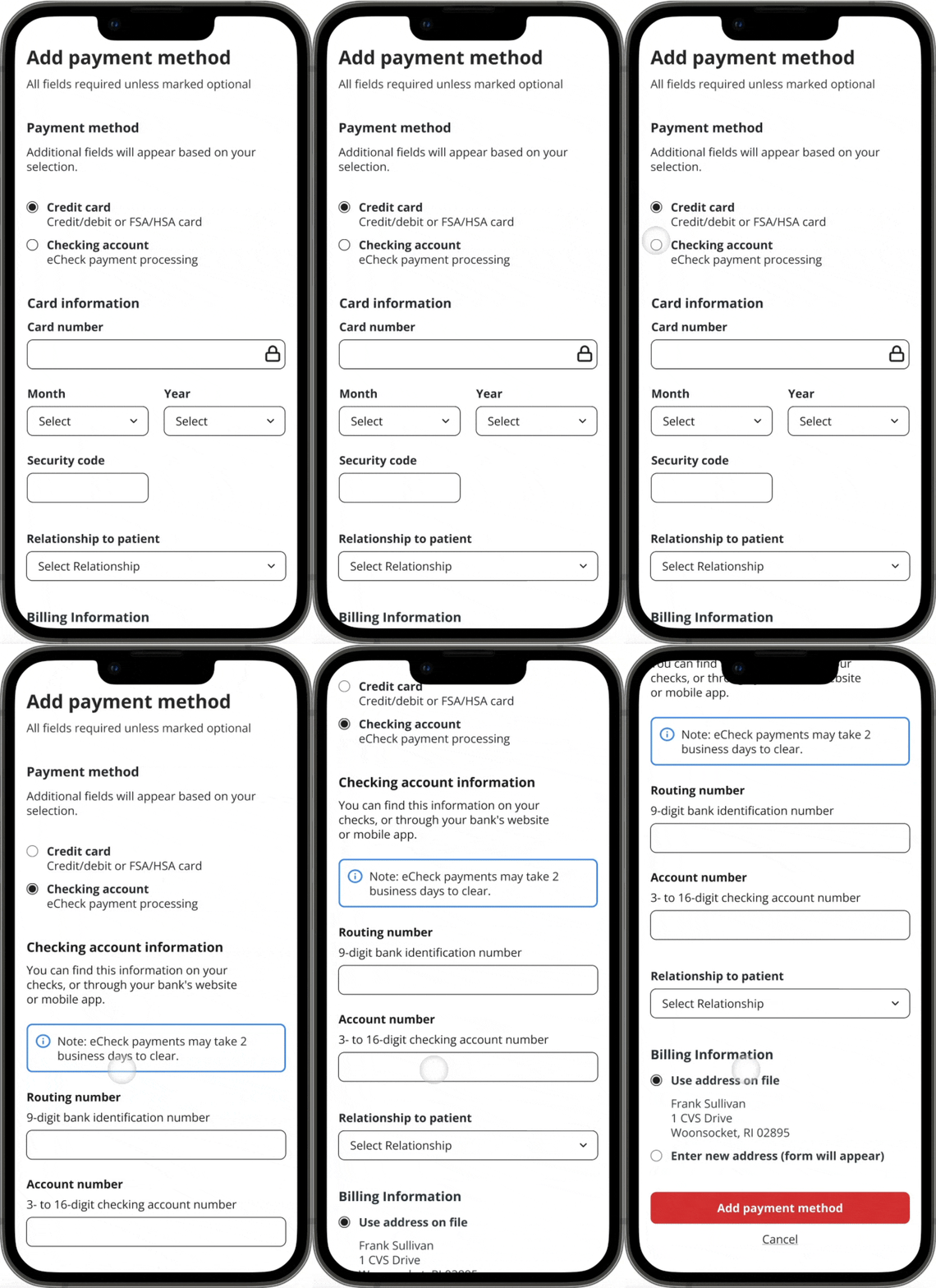
The entry point for adding a card or checking account is the add payment screen. On this screen, below the header, the user can select their payment method from a set of radio buttons. By default, this radio button will be preselected for a credit card.
Scenario 1: Adding Checking Account Information
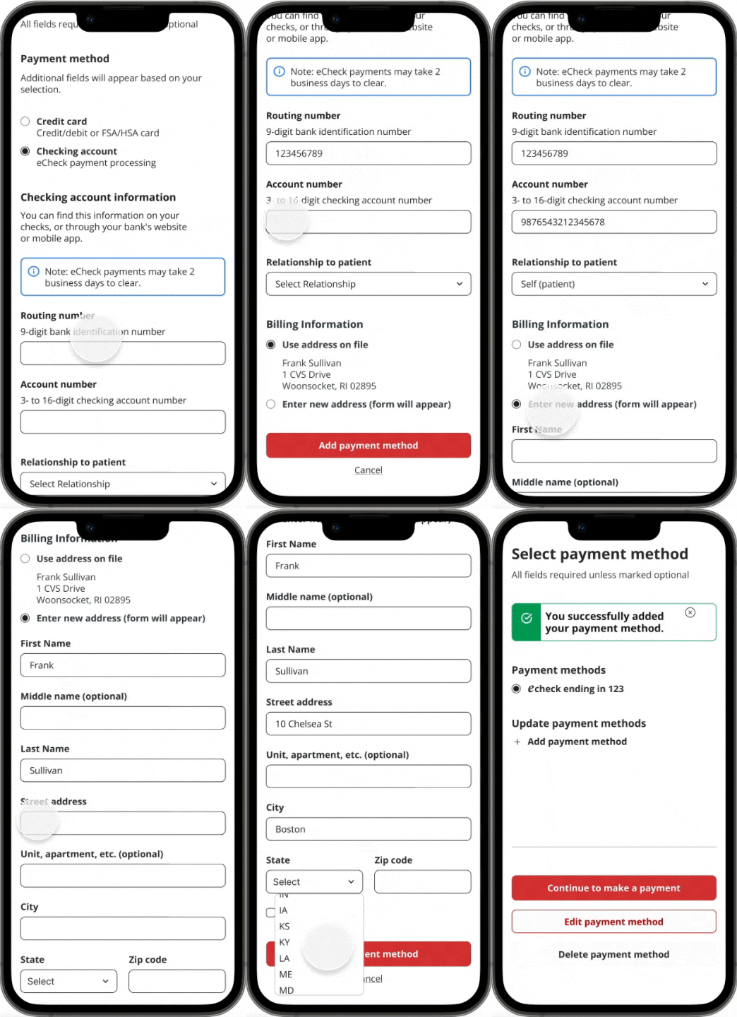
In this scenario, the user selects the checking account radio button, and the form fields for this section populate below. Since some users may be new to paying by check online, we added supporting text that explains where they can find the routing and checking account information requested in the form fields below. In the helper text, we inform the user how many digits are required for these form fields. We also included an informational note explaining how long it takes for the check to clear. Next, we have a Relationship to Patient field. This is a legacy field that may be removed in the future.
Scenario 2: Editing Checking Account Information
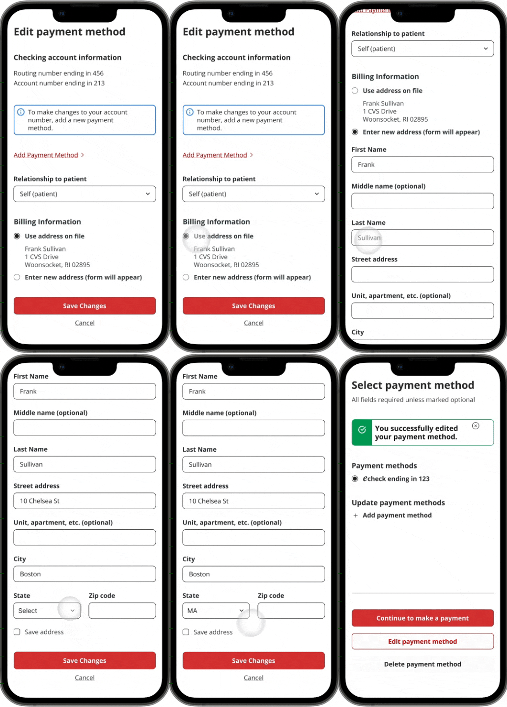
If the user wishes to edit their checking account information, they can select the Manage Payment link. Here, they can select the edit button on the card with their checking account. This button leads to the Edit Checking Account screen. Here, they can see the last three digits of their routing number and account number, but cannot edit them. In the next section below, they can edit their relationship to the patient field and their billing address. We have added an informational note to inform users that they will need to add a new payment to make changes to their account.
Process: Mapping the eCheck Experience
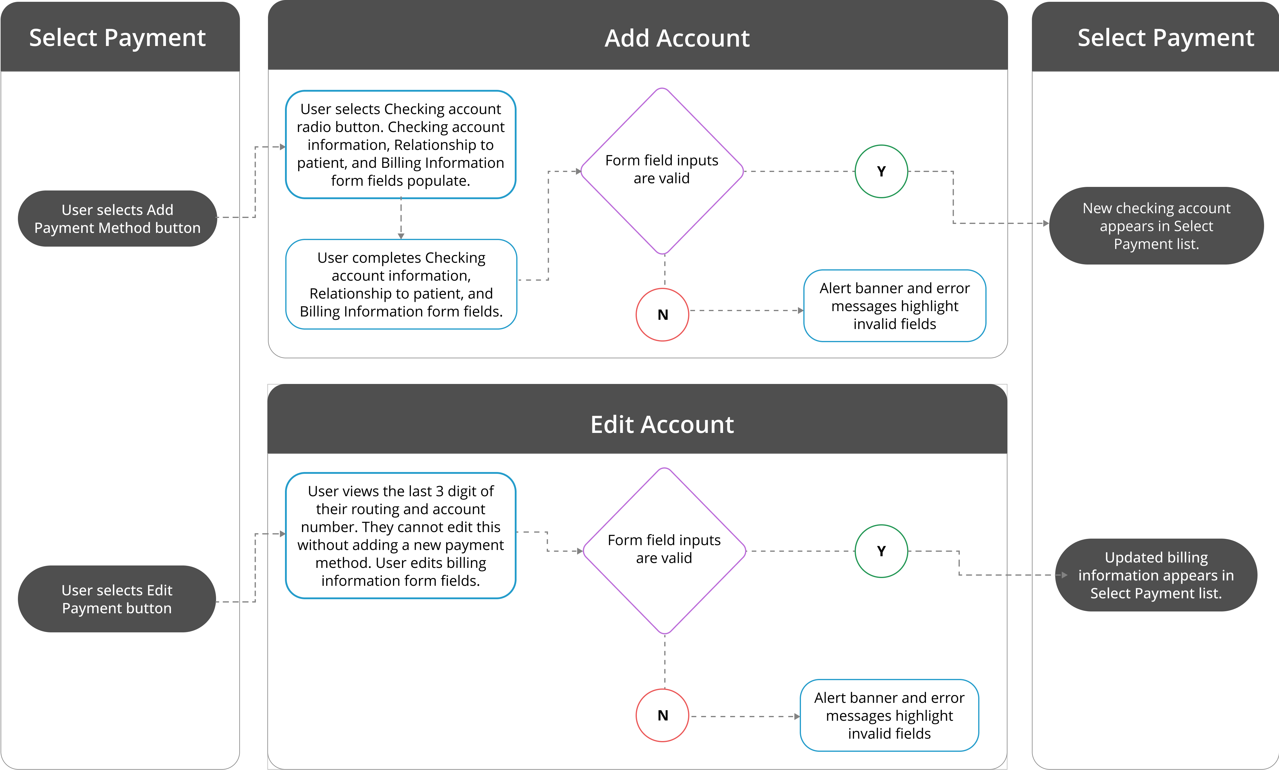
Once I had a better understanding of electronic check processing, I mapped out the user journey for both adding/ editing a card and adding/editing a checking account. Since the entry point for editing a checking account was to add a card screen, it was important to incorporate this experience. I structured the journey map into two parallel sections so that cards and checking accounts experiences were clearly designated. As I mapped out the experiences, the gaps became clear. To add clarity to the Journey Map, I added visuals and annotations so that each scenario was clear to stakeholders.
eCheck Reduced Overhead Costs of Payment Processing by 25%.
While learning about a new online payment process was challenging, I’m proud to have designed an atypical payment experience and integrated it cleanly into the existing payment architecture. Through this eCheck initiative, we reduced the overhead costs of payment processing by 25%. The eCheck design provided the Specialty Pharmacy Digital Team with scalable, customizable web components to support their customers' ability to pay for their prescriptions in a secure, seamless way.