Simplifying the Select Payment Experience
40%
Reduced complexity

CVS Health
We worked as a fully remote team spread across the US. Partners included:
Benchmarking industry leaders to identify patterns and gaps.
Exploring multiple approaches before committing to a direction.
Translating concepts into production ready designs.
Ensuring the design is accessible to all.
Modeling across multiple scenarios to ensure coherence.
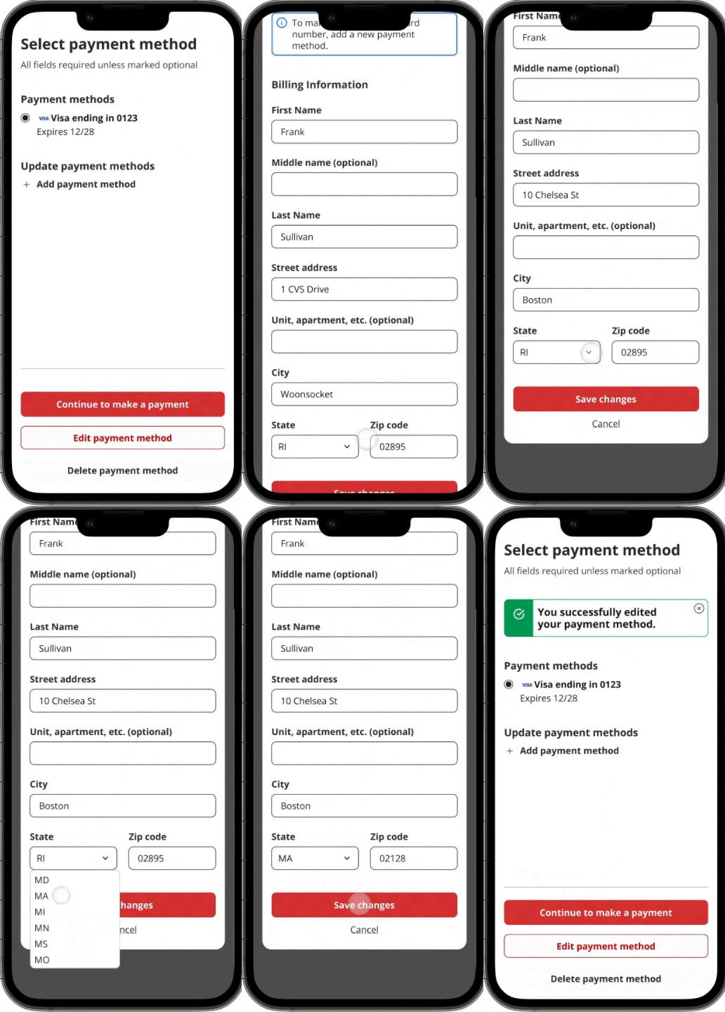
A user wishes to update the address associated with their payment method before checkout. In the redesign, they see their payment options displayed as radio buttons with three CTAs available for a valid card: Continue, Edit, or Delete. They select Edit, the modal appears inline, they update their address, and continue without leaving the page.
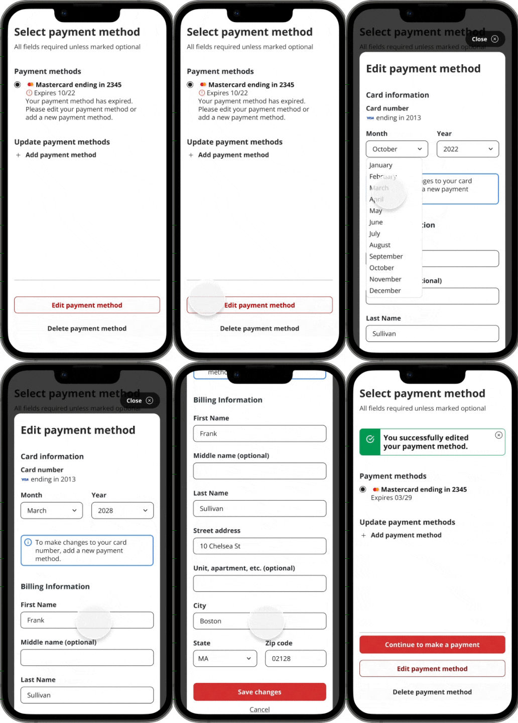
A user has an expired card on file. Rather than showing a disabled CTA with no explanation, the redesign shows only Update and Delete as available actions for the expired card, clearly signaling that the card needs attention. They update the expiration date and continue. Previously, this would have required leaving the flow entirely.
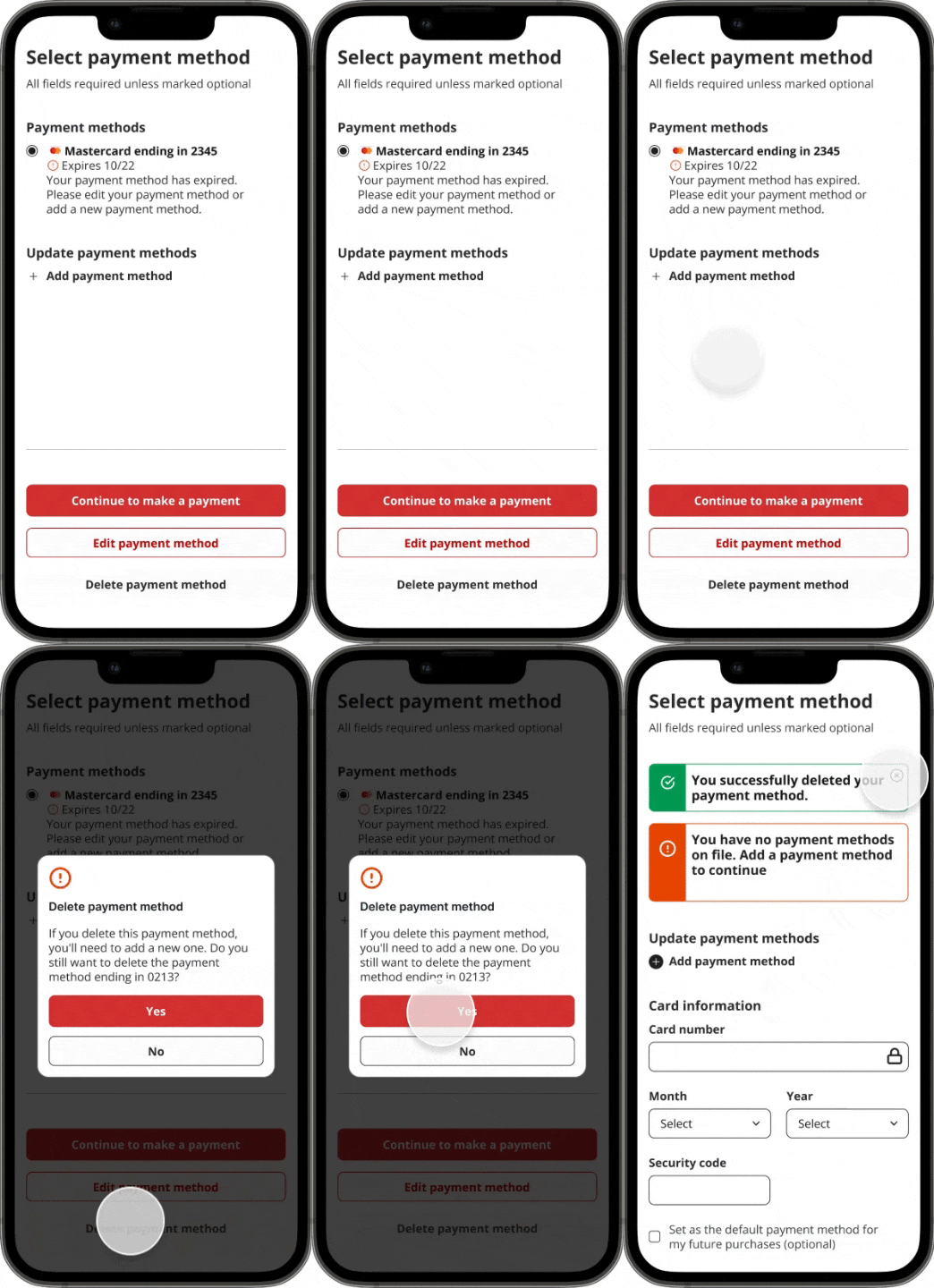
Previously, deleting a payment method was done in the manage payment section of the payment experience. So, if a user noticed an expired card while selecting a payment method, they would have to leave the experience. In our improved experience, users can delete payment methods in the Select Payment Screens.
A user has deleted their only card and needs to add a new one. In the original design, they would have had to navigate away, add the card, and return. In the redesign, they select the Add Payment button, complete the form in-flow, and their new card appears immediately in the payment list. The user is now ready to select and continue.
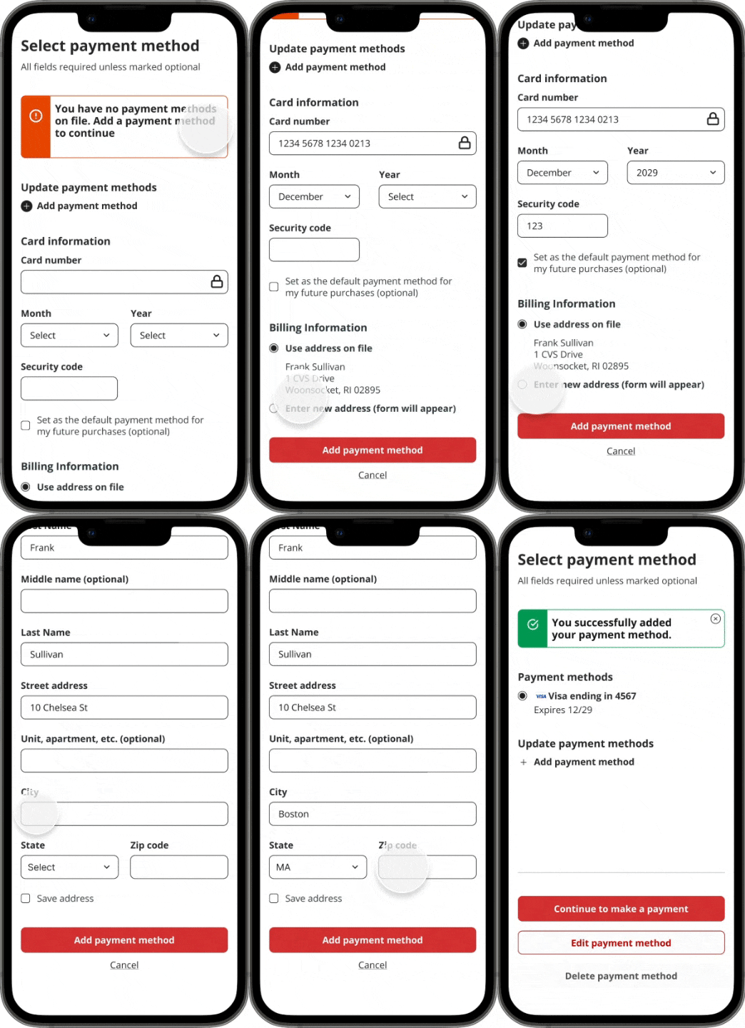
The new radio button design removed the image-in-dropdown violation and ensured users always had a clear, actionable path forward, even when no valid payment method existed.
What was once three separate, disconnected experiences (select, edit, manage) was consolidated into one coherent interaction.
Tasks that previously required navigating away from the flow, such as editing an expired card, deleting a payment method, and adding a new card, could now be completed in-context, without interruption.
Previously, if a user wished to add a card while on the select payment screen, they would select the add payment link, which would bring them to the add payment experience. Once they have completed the form, they automatically return to the select payment screen. In our streamlined redesign, the user can add a payment without leaving the select payment experience.
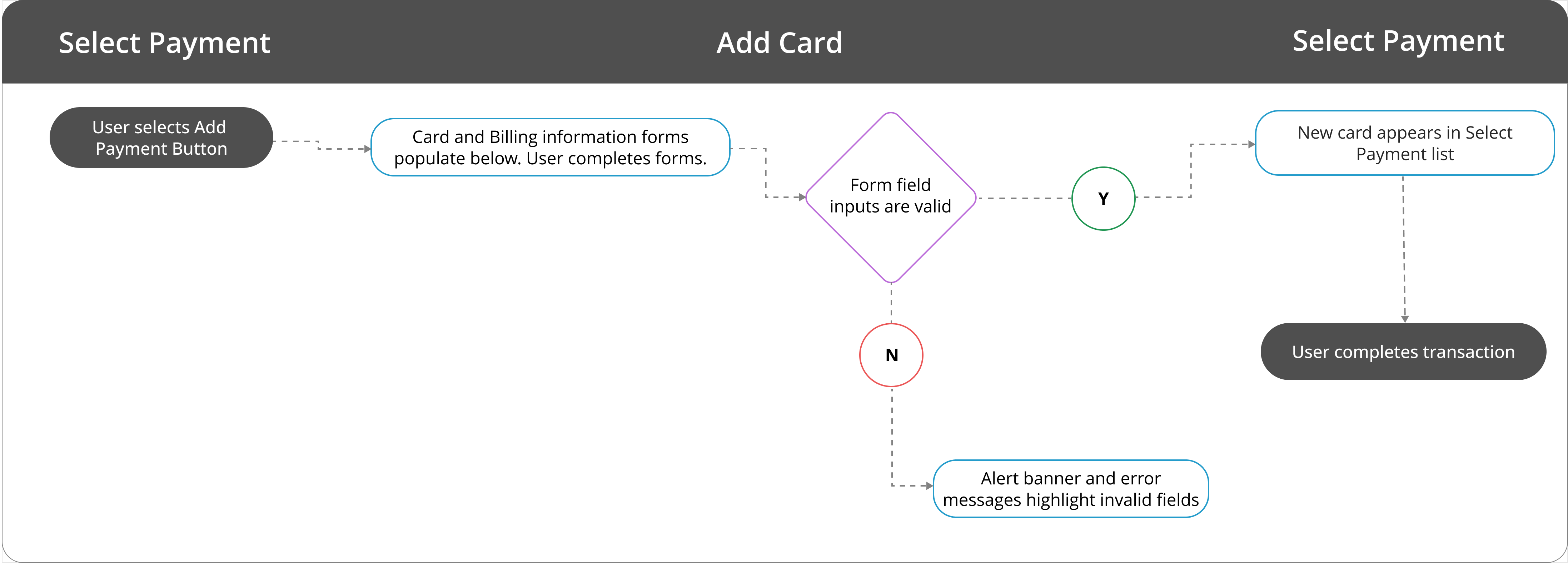
Transaction completed in 66% fewer steps than in previous design
On this screen, the user selected the edit button on the payment method card. Unfortunately, once the user edits their payment method on the Manage Payment screen has no way back to the Select Payment screen. In our redesigned experience, the user can select the Edit Payment Method button on the Select Payment screen, revise their payment information in the model, then return to the Select Payment screen
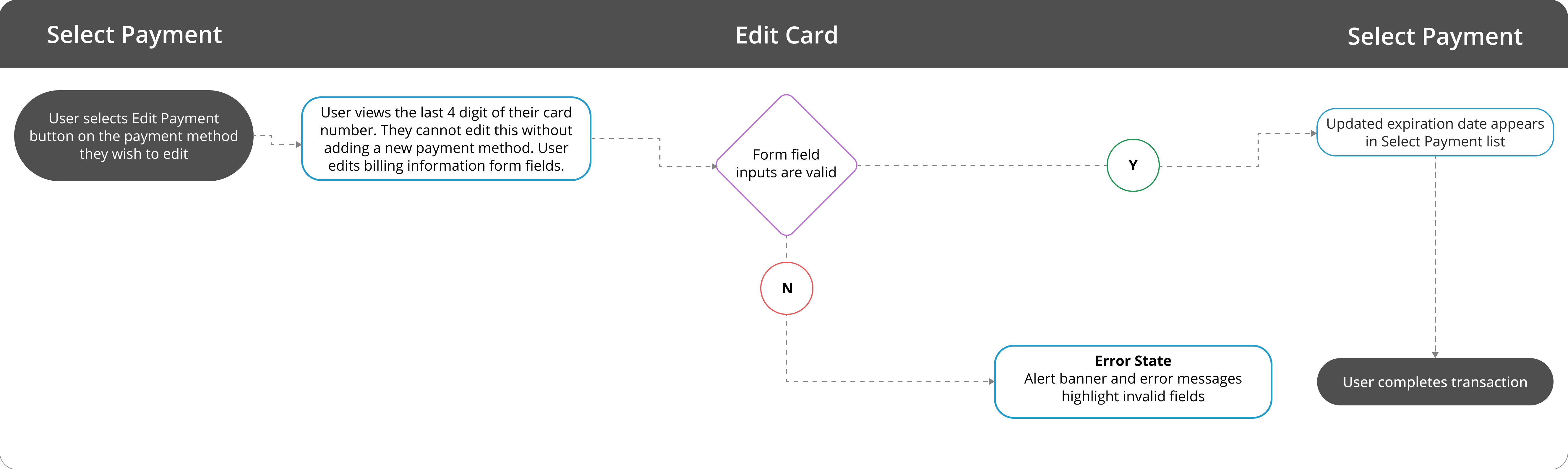
User edits card in 4 steps rather than 7
